Finding a visual language for training
I spent the first three weeks of the project exploring how to visually communicate the training environment.
- visual identity
- OpenBridge
- process
One of the biggest challenges with introducing training inside critical interfaces, is how it is separated from the interface itself. It has to be clearly communicated to the user that the training components are a separate layer and mode than the actual interface, but at the same time, the components needs to be in the same family as OpenBridge in order to be a part of the design system. The training environment should feel safe to make mistakes in, motivating to return to, and human enough that people actually want to learn from it, while at the same time keeping the technical and structured quality of OpenBridge. This was my starting point: figuring out how to achieve this fine balance.
What are the industry standards and legal limitations?
Before touching Figma, I did a quick mapping of how training for maritime workplaces are done today, and what regulations are at play. There are many standards, like ISO, IEEE, IEC, ISA and EU laws, that describe everything from how manuals should be structured, to how much training is required. These typically describe paper manuals and training in classrooms or simulations, and I have not found standards that combine these: manual and training in one digital experience. What I have seen is a shift towards digital training that might mark an opportunity for an OpenBridge training pattern; the EU regulation on machinery will allow manual for machinery to be digital from January 2027.
Visual identity exploration
Color
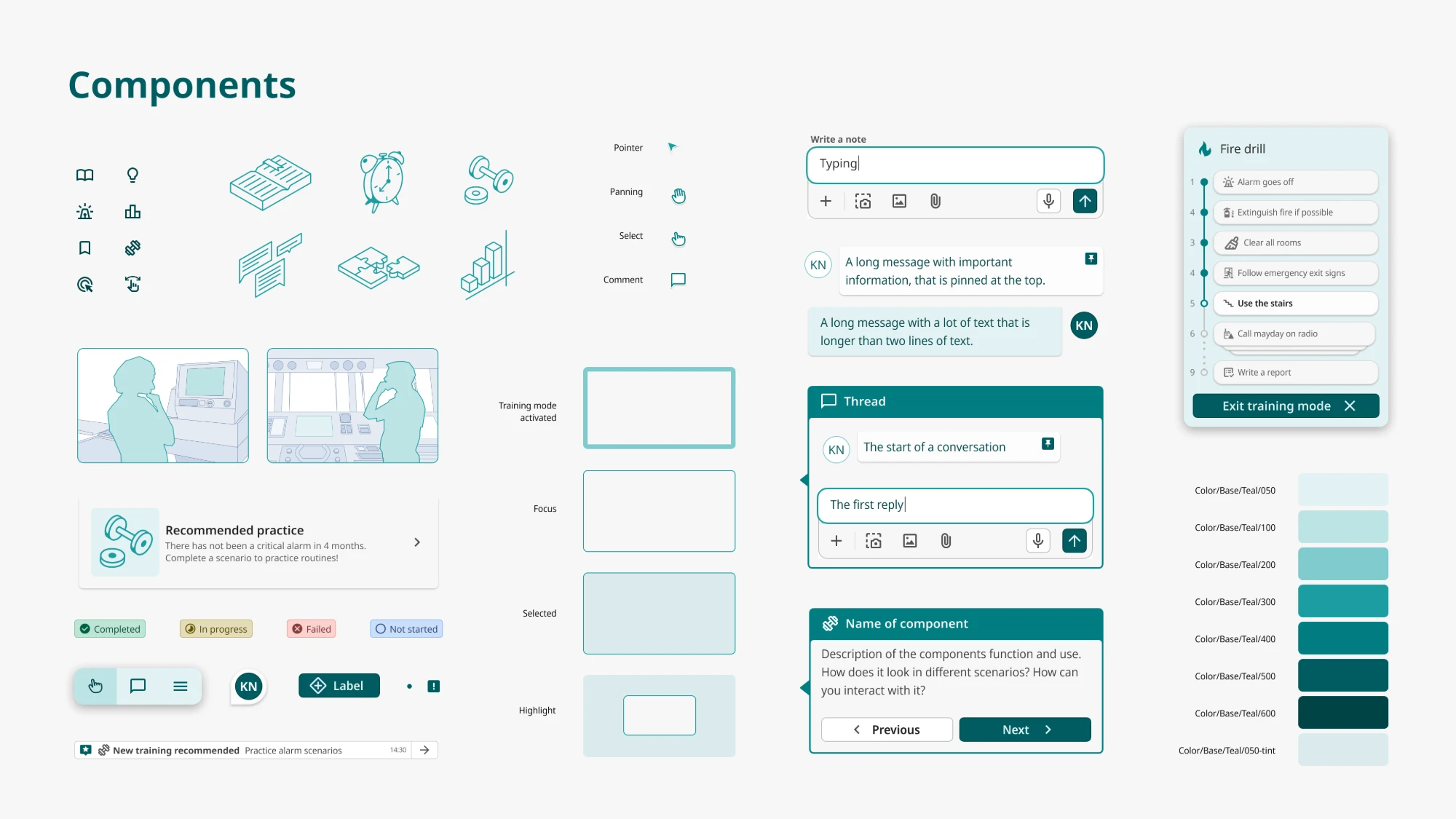
I decided to not add another color into OpenBridge’s already extensive palette, in order to stay clear of contrast and legibility conflicts. I looked at the categorical palette, to see if any of the categorical colors could work as an identity color for training overlays. I looked at contrast to other critical colors in the library, and landed on teal being the strongest contestant, based on both feel and contrast.
Typography
Noto is the font used by OpenBridge today, and with good reason. Its vast range of languages makes it ideal for a universal design system like OpenBridge. I think this is a quality that the training overlay also benefit from, but I have experimented with some of the other styles in the Noto family. Noto Serif is one that could be interesting, as the serif gives association to books, learning and can help achieve a less technical tone. At the same time, there is no practical reason to use a serif font for a completely digital interface, so this needs to be tested further.
Showing training mode
Big visual cues that tells the user they are in training mode is essential. I have tested several ways of doing this, from color, frames, overlays, patterns and menus. A combination of visual cues is perhaps the most effective. The current sketches uses colored frames and overlays as the main visual cues, but will need more iterations.
Icons and illustrations
I think illustrations can be an effective way to shift the tone of the communication to something more human and approachable. I have experimented with isometric spot illustrations as a way of giving the training character. After feedback, these are a bit too personal, and would need to be more modular in order to be introduced in the design system.
Testing concepts for in-interface learning on real screens
Instead of attempting to map out every possible way training might occur, I tested the concept directly inside an actual interface built on OpenBridge components. I plan to do this with several cases, hoping that when adjusted to a certain amount of cases, the essential training components will be revealed.
The starting point was a non interactive monitoring screen for a factory, and so far, these are the concepts I have sketched out:
Training home page in the settings menu
A home page for training provides a personal experience, with a progress log and personal recommendations.
Onboarding and courses
Maybe the most fundamental intro level training is a run-through of the most important functions. When combined with testing, it could be a good basis to make certificates for the completed training, that can be repeated when necessary.
Explore
Training in context is maybe one of the more interesting concepts I have tested, and the most unique to this project. In Explore mode the interface becomes clickable without controlling anything real, and pinned comments and tips from other learners or instructors surface directly on top of the real UI elements they refer to.
Scenario based training
Some of the most critical situations we need to train for almost never happens. With a dedicated scenario page, you could practice these edge cases in the interface, similar to a fire drill.
Status
The visual concept that came out of the first weeks of sketching is not a brand new identity to add to OpenBridge, but rather a collection of customized OpenBridge components with a new pedagogical layer. It borrows OpenBridge's existing structural language (tables, cards, navigation patterns, cursor and interaction conventions) almost entirely as-is, because consistency with the system operators already trust is valuable. The shift happens in a smaller number of deliberate places: illustrative graphics, contextual annotation layered directly onto real components, and a slightly warmer use of card and badge components to mark progress and encouragement rather than status or alarms.
Some concepts I have not yet had time to explore, but that I think can be promising, is animations and the use of second screen. These I hope to further explore in the weeks to come. Moving on I will further develop the concept sketches to clickable prototypes, in order to test the concept on users and iterate from there. By involving users I hope to explore the pedagogical layer of the application, and see what actually works in practice.